A book I loved, Storytelling with Data
I have always been a fervent supporter of minimalism in design and clear communication. Storytelling with Data by Cole Nussbaumer Knaflic is a book that resonated with me on many levels. It is a practical guide to creating effective data visualizations that tell a story.
The book is filled with examples of good and bad visualizations. Having benefited from the book, I thought that the next step would be to implement those examples that made an impression on me in code and make them available to anyone.
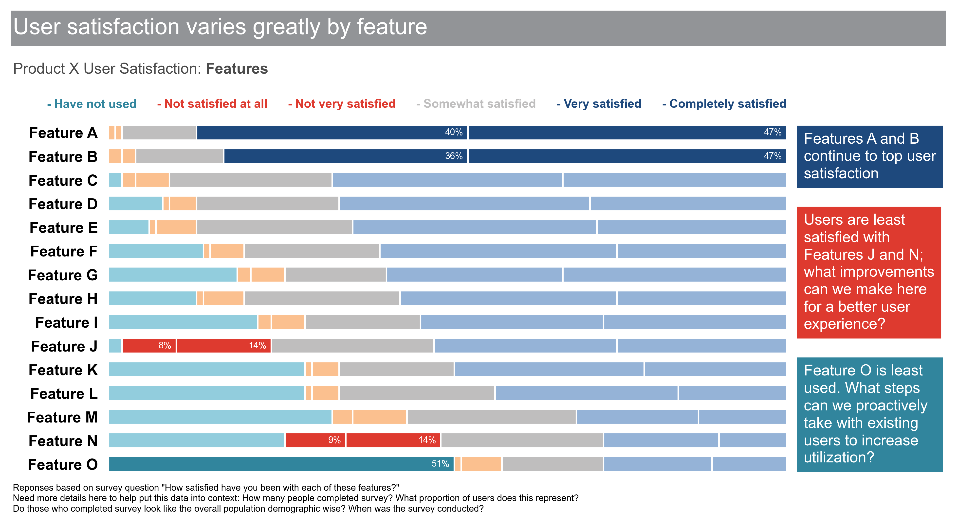
I found an existing repository, empathy87/storytelling-with-data, with code for some of the visualizations in the book. I thought “Great, I can contribute to this repository”. I searched for the visualization that made the biggest impression on me and did not find it in the repository, so I forked the repository and implemented it, exactly as it is in the book:

empathy87’s repository really helped me get past the initial hurdles of implementing custom visualizations with python, and considerably accelerated my learning. Since implementing the above visualization, it has been much easier to create visualizations exactly how I envisioned them and to communicate ideas and insights more effectively and clearly to stakeholders.
I am grateful to the author of the book and the creator of the repository for the help they provided me, and hope that my contribution will futher assist others in their journey to create effective data visualizations.